Case Study
Wealth Management Dashboard
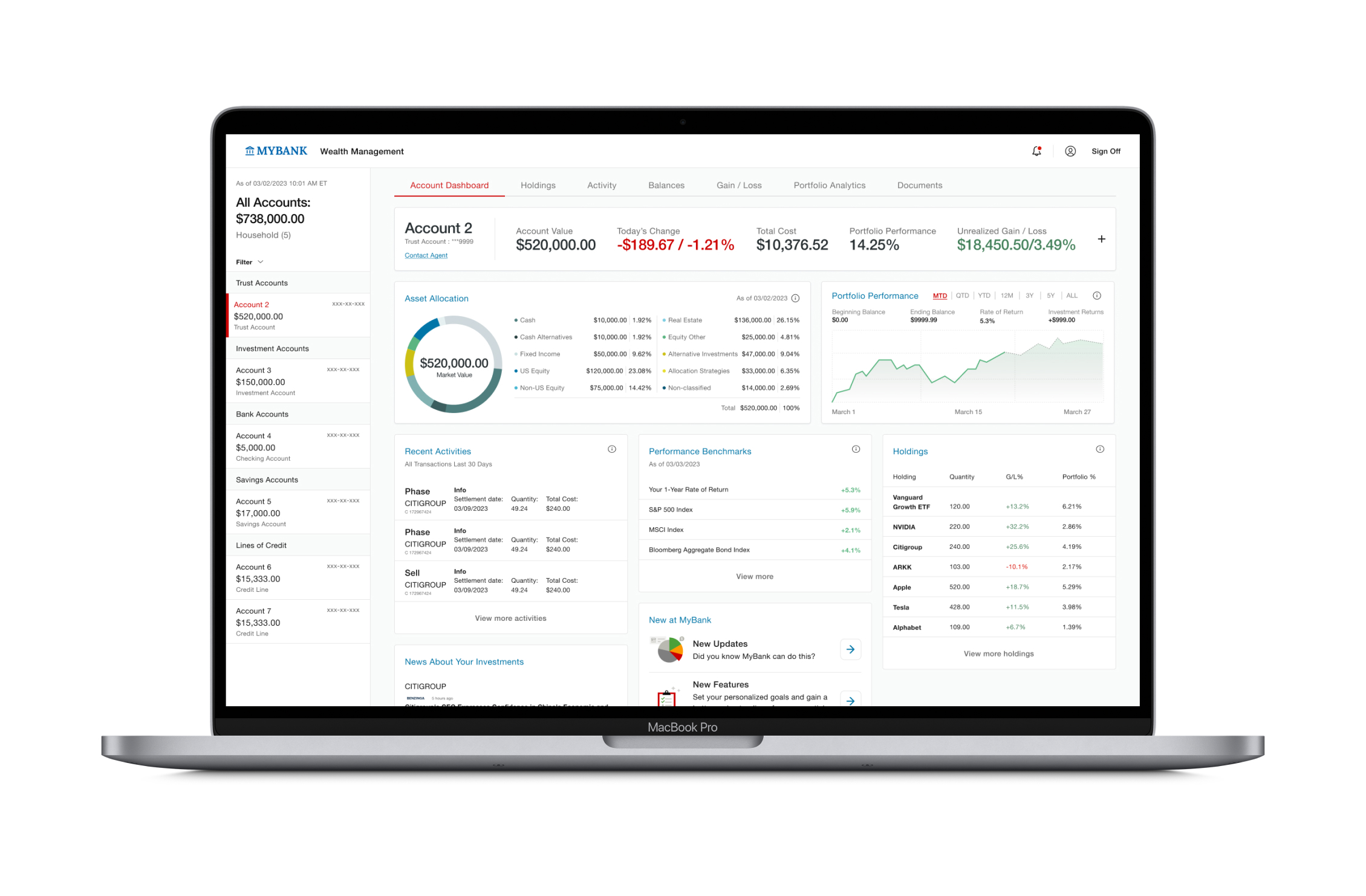
How might we design a Wealth Management experience that allows WM Advisors and their clients to better monitor portfolio health and account details?
Background Context
The bank faces a significant challenge in providing Wealth Management Advisors with efficient and accessible tools to monitor their clients’ portfolio health and account details. The absence of such tools has created a gap in the bank’s service offering, impacting the quality of relationship between advisors and their clients. Consequently, there is an increasing need for the bank to implement effective solutions that enable WM clients to monitor and manage their accounts more efficiently in a user-friendly way.
The Problem
WM Advisors and their clients lack a digital experience that allows them to easily and efficiently monitor and manage their Wealth accounts.
I worked on this project as the lead Product Designer alongside a UX Strategist. My responsibility was to conduct discovery research, identify opportunity areas, and design a prototype experience based on our findings.
The target users are Wealth Management Advisors and their Private Banking clients. Private Banking clients are those who have a minimum of $1M in investible assets. They are considered premium clients, and have different touchpoints (and subsequent user needs) with the bank than a typical relationship client.
1 month timeframe
Product Goals
Improve Wealth Management experience for Advisors and clients.
Design Goals- Understand current industry best practices.
- Understand current user needs.
- Determine a design direction that improves the Wealth Management UX for Relationship Managers.
- Receive internal funding to develop WM Advisor dashboard
- Increase online engagement with WM client base for KPB accounts
- Client retention & relationship quality
- Usability testing results
- Stakeholder support for funding efforts
Solutions
Meeting User NeedsThe following solution was developed through an iterative design process informed by competitive analysis, user interviews, SME interviews, and A/B testing.
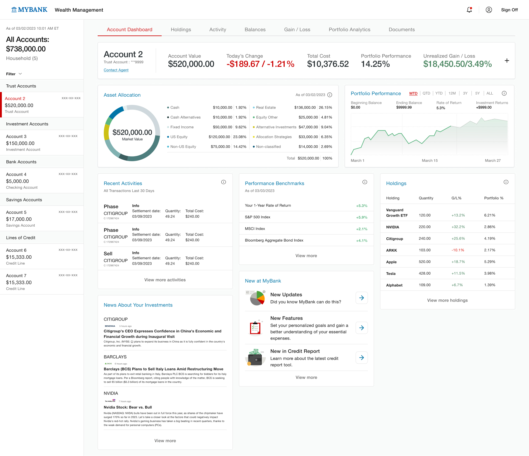
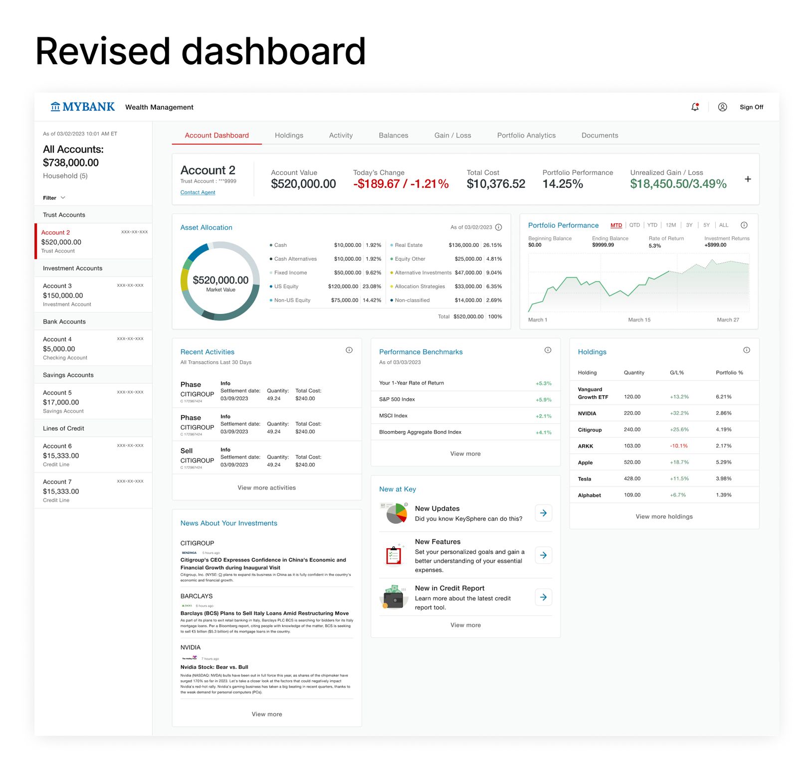
Account Overview Bar
The Account Overview bar summarizes the most important at-a-glance information and anchors to the top of the user's dashboard.

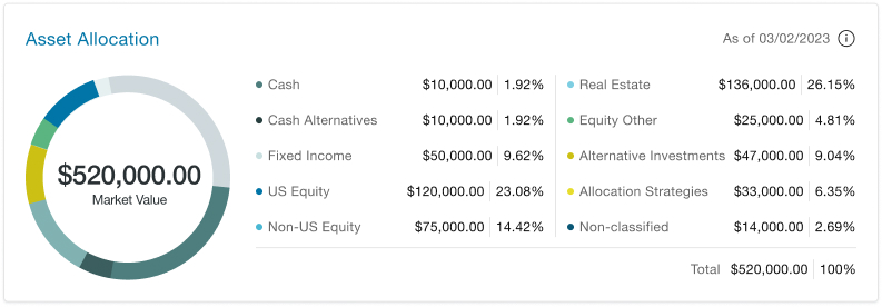
Asset Allocation Panel
This panel helps visualize the asset mix of the client's account.
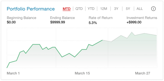
Portfolio Performance Panel
This panel helps the user see account performance over different time periods.
Recent Activities
This panel helps the user see most recent account transactions.
.jpg)
Performance Benchmarks
This panel helps the user understand the performance of their portfolio in the context of benchmark return indexes.
.jpg)
Holdings
This panel displays the client's top investment holdings as well as individual holding performance.
Holdings Panel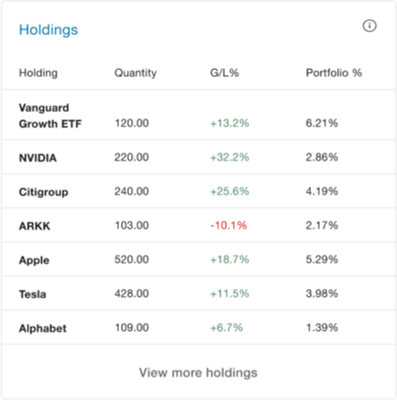
News
Based on research findings, we realized that users prefer to have contextual information to understand what may be causing performance changes. A news panel provides that context and helps the data make more sense.
We also added a module for news within the user's bank. This helps the user stay updated with any new changes to their Wealth Management experience.
News Panels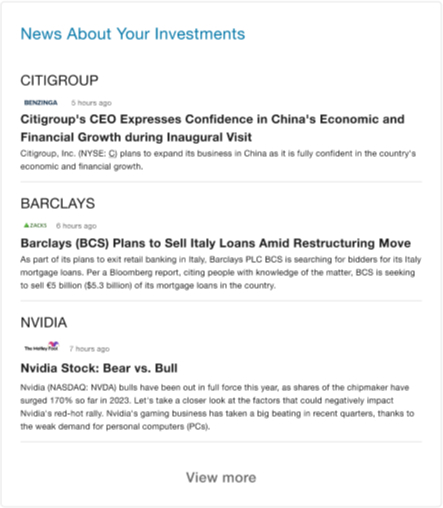
.jpg)
Research Process
To ensure that our design decisions were user-driven, my team and I conducted research to better understand current pain points, industry trends, opportunity areas, and validate assumptions.
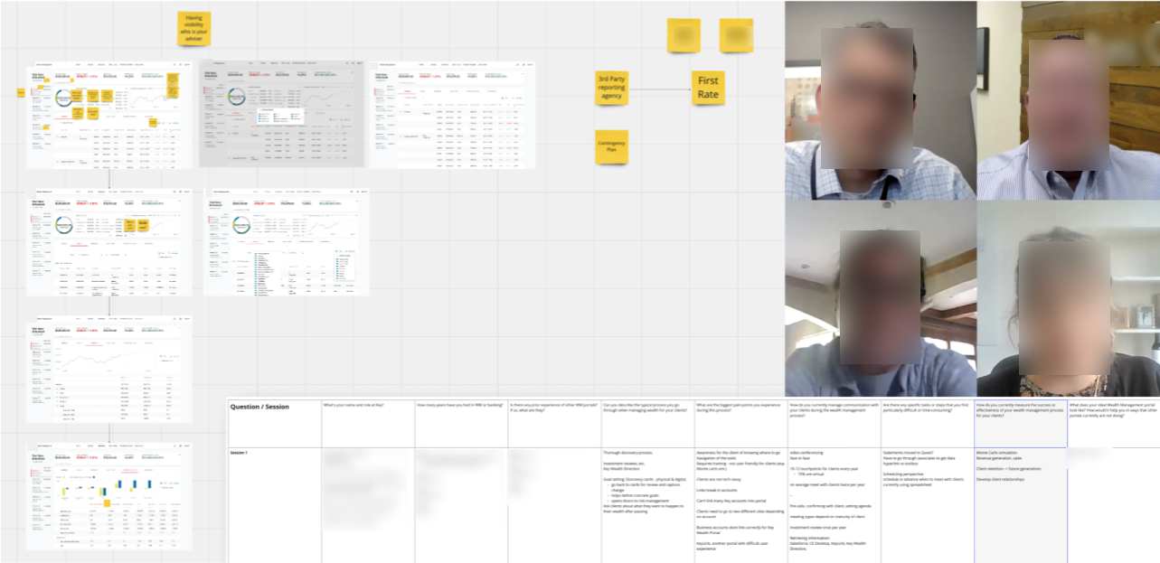
My research steps consisted of:- SME Interviews
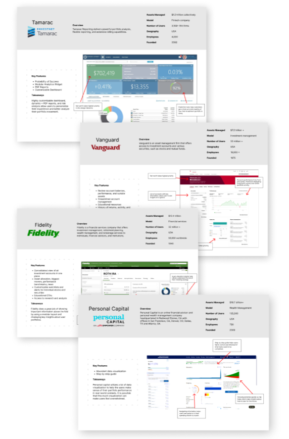
- Competitive Analysis
- User Interviews with WM Advisors
SME and User Interviews
Opportunities- Opportunity to enhance customer satisfaction, improve efficiency, improve risk management, and create a competitive advantage
- Lack of client awareness to know where to go to complete goals
- Current wealth management experience requires training to use and is not user friendly
- Clients are not tech-savvy
- Clients need to use multiple different websites to manage their account
Competitive Analysis
Learnings- The use of pie charts to represent asset allocation above-the-fold is prevalent in more than half of the products.
- A modular tile system is widely adopted by around three-fourths of the products to organize different data points on the page.
- The default color theme in the majority of products leans towards a light mode theme.
- A notable trend is the utilization of line charts above-the-fold to illustrate account performance, which is observed in almost half of the products.
- Validated design assumptions:
- Performance benchmark module
- Customizable interface
- Use of dashboard modules pulling from different data points of the account.
- “News” and “Education” modules help educate and provide context to users.
- Insights such as “Probability of Success” or “Projected Retirement Age” would help users better understand the data.

Design Process
The design process began from a low-fidelity mockup provided to me by stakeholders and the Design Strategist on my team. Our competitive analysis validated the most important features on the mockup.
Collaborative Process
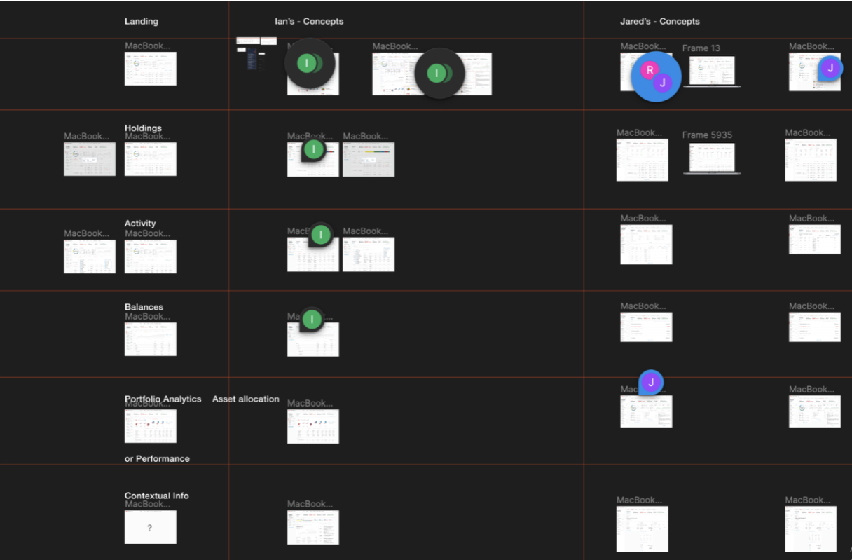
Based on the SME knowledge, user interviews, and competitive analysis, my team began creating design solutions. We developed a working process to rapidly iterate and refine the dashboard design. We each created our own independent iterations and used them to A/B test with users.
A/B Testing
A/B Testing helped us get quick and insightful feedback that ensured a user-driven design outcome.
We used the testing session to identify the strengths of each design. The results of the test showed us that the design of Option 1 was unanimously preferred, but it lacked the "Holdings" module that Option 2 had.
We regrouped and combined the successful features of our independent iterations into a new, revised mockup.
-p-1600.jpg)
Outcomes
Successes and Setbacks
Our final deliverables were met with positive feedback all-around. The design was successful by all user-centered performance metrics.
- Increased stakeholder support for funding to develop the prototype.
- Usability tests showed an increase in ease-of-use from the existing management experience.
- Currently undergoing final usability testing sessions with clients.
The largest setback we faced was development priorities. Some features (Bank news, Investment news, and Top/Bottom movers) were deprioritized by stakeholders for the MVP experience. Although our research proves the positive impact of these features for the user experience, they may not make it into the first iteration of MVP due to development timeline priorities.
Learnings
From this experience, I’ve learned the importance of uncovering constraints early on in the discovery process. It’s important to dig deeper past the initial constraints that stakeholders present, since there are typically other constraints being overlooked, such as development priorities.