Case Study
Lincus
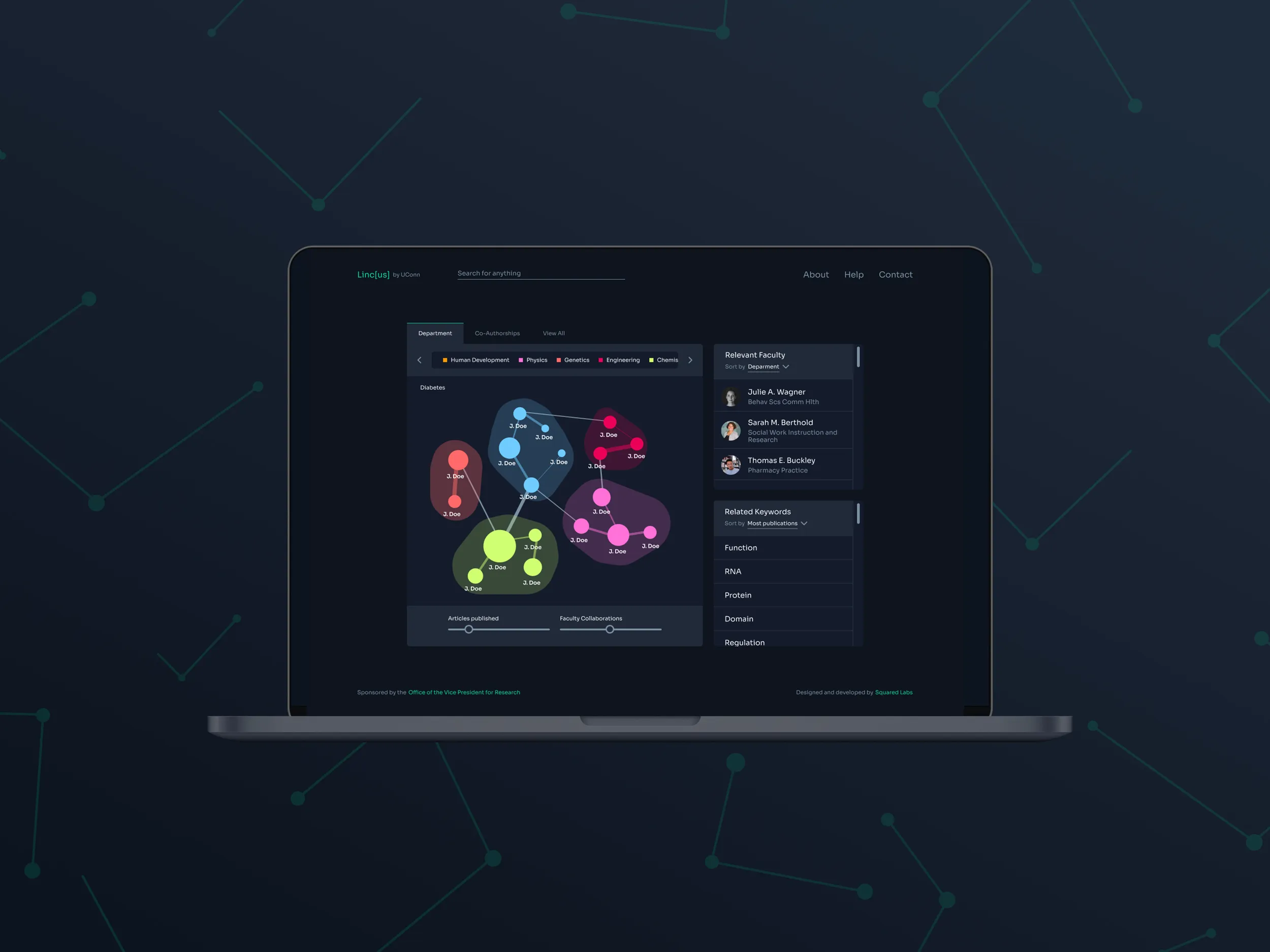
Redesigning an academic search engine to improve user-friendliness and attract new students.
UX/UI Designer
D. Schwartz - COR²E Director
B. Norris - Software Engineer
C. Ladd - Graphic Designer
Background Context
Lincus is an academic search engine for scientific research expertise. Users can search for terms such as
“genetics” or “diabetes” and see a visualization of what experts are conducting research in that
field.
There are two versions of this software - one is intended for the general public, and the
other focuses exclusively on experts at the University of Connecticut. I worked on redesigning the
version of the software pertaining to the university.
Lincus was the brainchild of a team of
developers at Schwartz Lab, a UConn-funded startup that creates software to improve research at the
university. In the early 2010s, the Lincus developers created this powerful tool but never received
input from designers during its creation.
The Problem
Navigating through Lincus is not intuitive. Instructions are needed to understand how to properly use the software. Its visual design is bland and does not represent UConn as cutting-edge.
I was hired as the lead UX/UI Designer for the Lincus overhaul. My responsibility was to rethink how to communicate the data within Lincus to create an easier user experience while also creating a new visual identity to position the tool as a modern and cutting-edge technology.
The target users for Lincus are graduate and prospective undergraduate students. By providing this resource, prospective undergraduates will be able to see the impressive research being conducted at the university and will ideally be more inclined to apply. For graduate students, Lincus can be a valuable networking tool for reaching out to expert faculty members when looking for mentors or grants for their research projects.
The biggest design constraint for this project was limited external research ability. Due to a lack of access to the user base, many design decisions were ultimately based on knowledge provided by an SME (Subject Matter Expert) and other stakeholders who have been involved in the project for the past decade.
Product Goals
Showcase the collaborative research that happens at the University of Connecticut.
Design GoalsCreate a more intuitive user experience with the software. Design a visual identity and interface that looks state-of-the-art, distinguished from the typically mundane university website style.
Business GoalsAttract prospective students.
My Success MetricsMy success was measured by internal feedback from stakeholders who were deeply familiar with the existing product. I presented design solutions at weekly meetings for approval and to keep developers in the loop with the design process.
Solutions
Meeting User NeedsTo arrive at the following solutions, I leveraged my research of stakeholder interviews and heuristic evaluation to determine prominent user goals. Throughout my design process, I created design solutions with the intent to allow more intuitive completion of user goals than previously experienced in the original software design. I presented these design solutions at weekly meetings for approval and to keep developers involved in the design process.
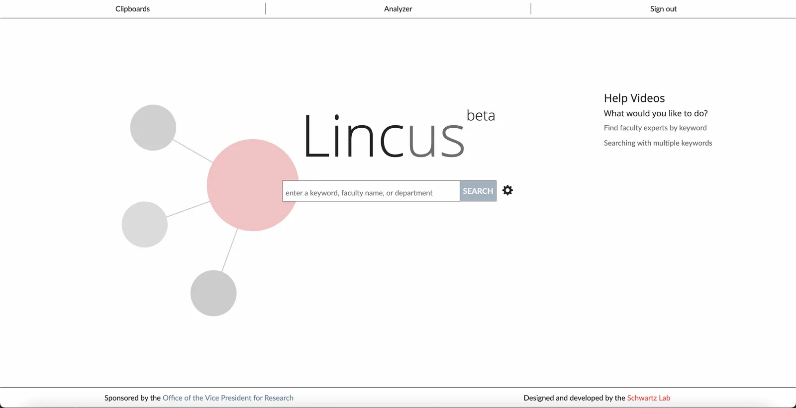
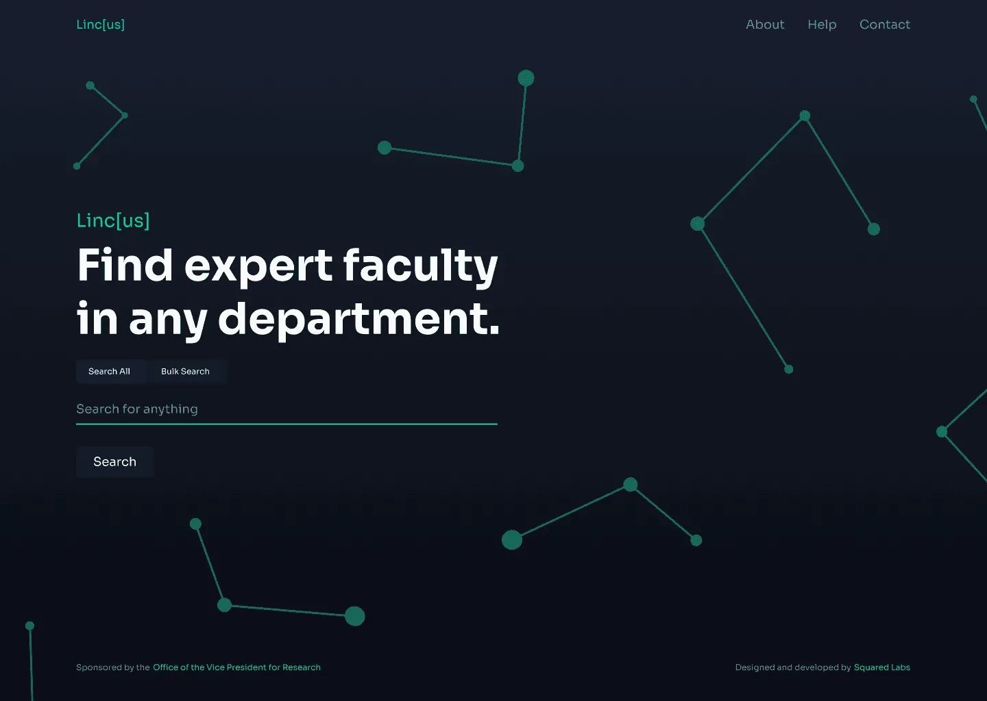
Refreshed landing page
The previous landing page was uninspiring and did not describe the function of the software. With the redesign, I utilized a more “tech" style color palette to bring some life into the website. I added a hero statement to clearly define what the software allows the user to do.
More intuitive search results
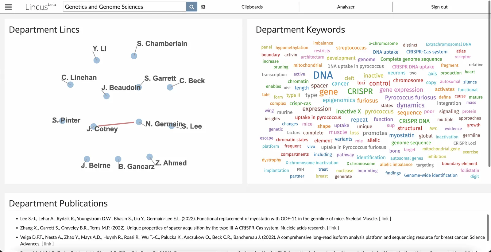
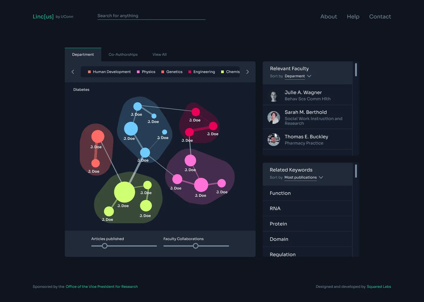
A key feature of Lincus is the force-directed graph it creates to visualize relevant faculty and
their connections to one another. These connections are visualized through lines with varying
thicknesses depending on how many publications the faculty have together. Individual authors with a
higher calculated “expertise score” are represented in larger circles.
In the original
design, a user can tell which authors belong to the same department based on the color of their
circle. However, there is no legend showing the correlations between colors and
departments.
The graph can feel confusing and unorganized, so I proposed the following
adjustments: group faculty by department and color code accordingly, introduce a legend displaying
department colors,
and adjust the size of faculty members’ circle based on the number of relevant publications rather
than “expertise score”.
Department categorization
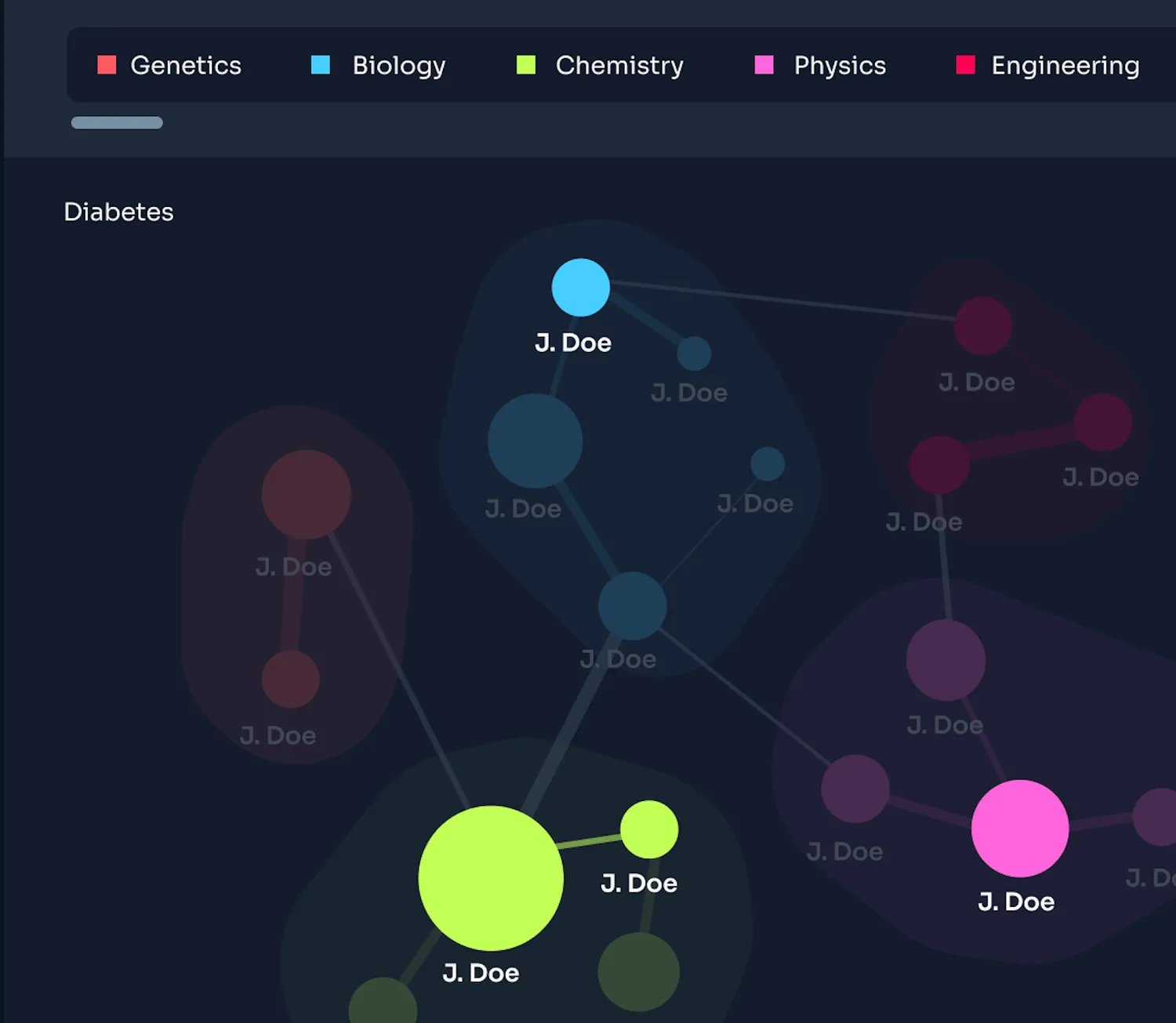
One of the pain points I experienced using Lincus was its lack of a system governing faculty
departments.
If a user wanted to see which faculty within a given search was located in the Chemistry department,
there was no way to determine that without going to an individual’s faculty profile.
I proposed an adjustment to the graph in which faculty would be clustered by department color,
meanwhile, a department color key would live at the top of the module. This decision brought more
structure to the graph.
Find the most relevant faculty members
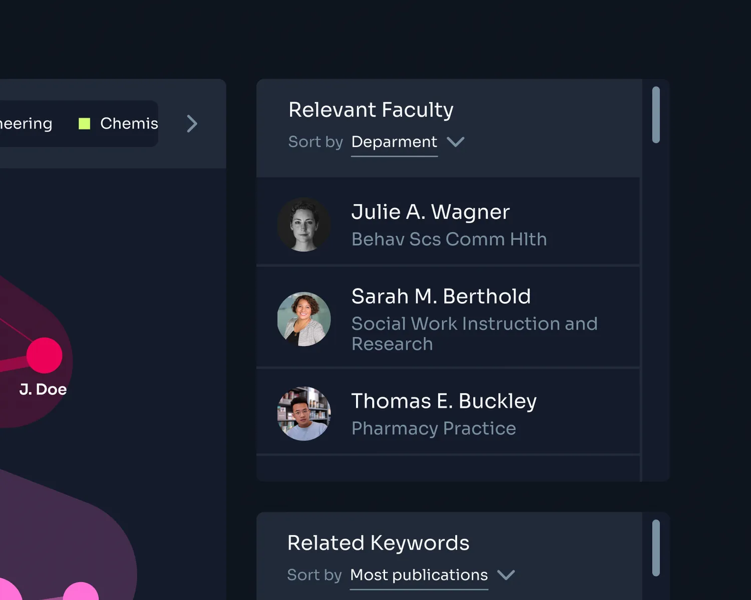
In another effort to make the graph information more digestible, I proposed to add a “Relevant Faculty” module onto the search result dashboard which essentially extracts authors with the most publications in the graph and orders them into a list. This addition allows users to find the most important faculty faster.
.webp)
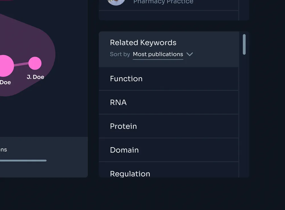
Related Search Terms
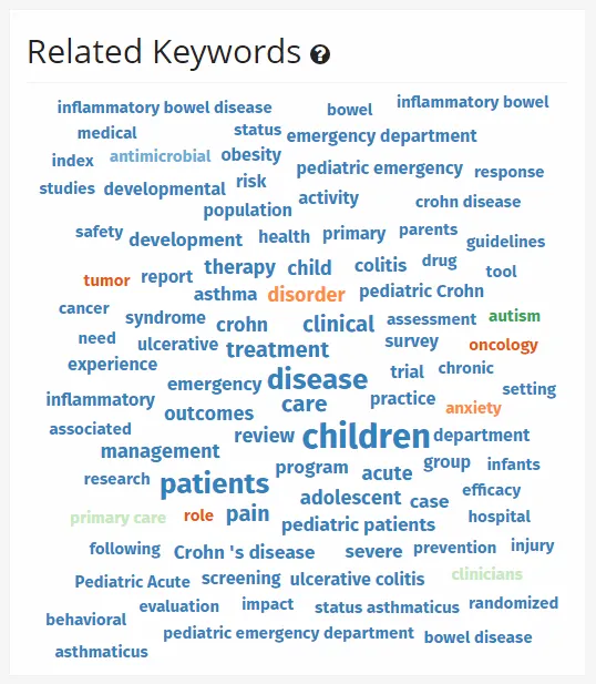
The previous design of the Related Keywords module was a major contributor to the clunkiness and
awkwardness of the web tool.
The previous design used a “word cloud” visualization, where the most relevant words were given
larger sizes.
We needed a related keyword system that was still able to show related keywords in a less
overwhelming way. I proposed to order them in a list instead.
Lincus Problem Solving Process
My problem-solving process is drawn from the Double Diamond Methodology and the Goal-Directed Design Process.
Research
- Define project scope (target users, user goals, business goals, constraints).
- Audit existing work and product.
- Stakeholder Interviews to understand product vision and constraints.
- User interviews and observations to understand user needs and behavior.
Define
- Utilize target user information to discover patterns in user behaviors, attitudes, aptitudes, goals, environments, and challenges.
- List requirements and necessary capabilities of the product.
- Determine opportunity areas.
Ideate
- Create low/mid-fidelity mockup ideas and get feedback.
- Develop a clear direction for the design solution.
Implement
- Design, iterate, and test higher-fidelity versions of the product solution.
Research Process
As a newcomer to the Lincus team, I had to research the product to learn and understand how it works. I analyzed the existing software and met with stakeholders to gain an awareness of its capabilities as well as their knowledge of user and business goals.
Heuristic Analysis
I conducted a heuristic analysis to determine major pain points within the user experience. As a new user, I was a fresh set of eyes compared to those in the team who had been working on Lincus for years, and was therefore able to verify assumptions regarding new-user difficulties navigating through the product.By analyzing and auditing the existing software, I was able to familiarize myself with the goals of the product as well as the major pain points that users face when navigating through it. These conclusions informed my design decisions throughout my design process as I worked to improve the user experience of the product.
Design Process
Introducing a design system
It was essential to develop a design system that would breathe new life into the product while also having the ability to structure the many different features of the application. We decided to use a dark mode theme to immerse the user into the software and offer a sense of modernity.
.webp)
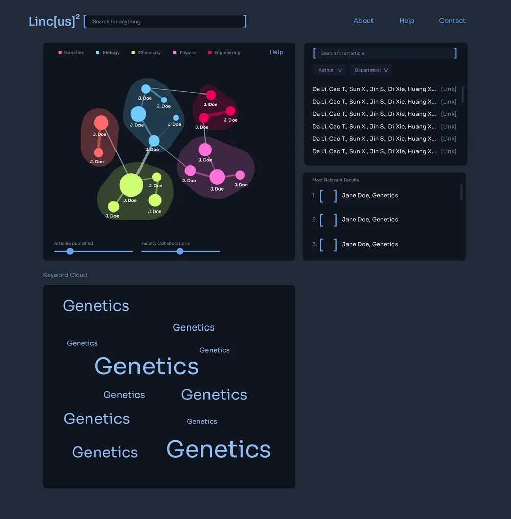
Iterating the Results page
My initial redesign concept solved a few pain points within Lincus such as department categorization and listing the most relevant faculty found in the graph. However, this design also revealed opportunities to push the user experience even farther.
We concluded that in this concept, the keyword cloud had lost its hierarchical significance since it was moved below the fold. It also still lacked a sense of order and consistency with the rest of the design.
The final redesign simplifies the number of modules to include what is most important for users to accomplish their goals of finding relevant faculty members.
.webp)
Improving Task Flows
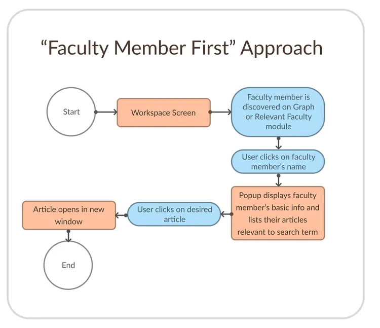
One of our key task flow improvements was the simplifying the process of finding faculty member articles. This was done by designing with a “faculty member-first” approach. Instead of displaying a dedicated Articles module, as attempted in the first redesign concept, we decided to change the task flow: only show articles after a user has clicked on a faculty member’s name.
This decision reflects a more intuitive mental model of finding information. First, the user finds their primary target (faculty member). If they want to find their secondary target (faculty member’s articles), it should be found through an interaction with the primary target.
In addition to being more intuitive, removing the articles module freed up space in the search result page, allowing the Relevant Keyword module to move above the fold; reprioritizing its place in the module hierarchy.
.webp)
Outcomes
Successes and Setbacks
The feedback from stakeholders after presenting the designs was overwhelmingly positive. The redesign offers all capabilities of the former product, and more, while doing so in a simplified and elegant manner.